Post-graduation, I was stuck in a rut. In a competitive industry, I came to have a nihilistic view of the graphic design profession, the subject I had just studied for three years in school. The work I did was rote and mechanical, always in service to passing design trends and fancy Adobe effects. I was more concerned with how I could technically render something than whether the imagery was actually effectively communicating the message I was given to work with.
Since, as a graphic and web designer in previous positions, time constraints often required me to find quick, easy solutions to the design problems I was presented with, I often skipped iterative process and architectural-style development in favor of just jumping head-first into Adobe Illustrator and cranking out a generic, if pretty, set of text slapped onto or around a quickly illustrated vector art or photoshopped background image. That’s not to say this can’t be an effective method to get the job done, but it's an easy way to skirt around attempting to truly understand the design problem at hand.
In the design work geared towards promoting myself as for-hire, I felt stagnant and indecisive. I felt my work was boring, and I tried to enhance it with gimmicky tricks that often fell flat or made zero sense. The problem with my design was that I had nothing relevant to say. This is why I stuck to pragmatic, matter-of-fact portfolio web layouts and designed things so weird and abstract as to appeal to no one.
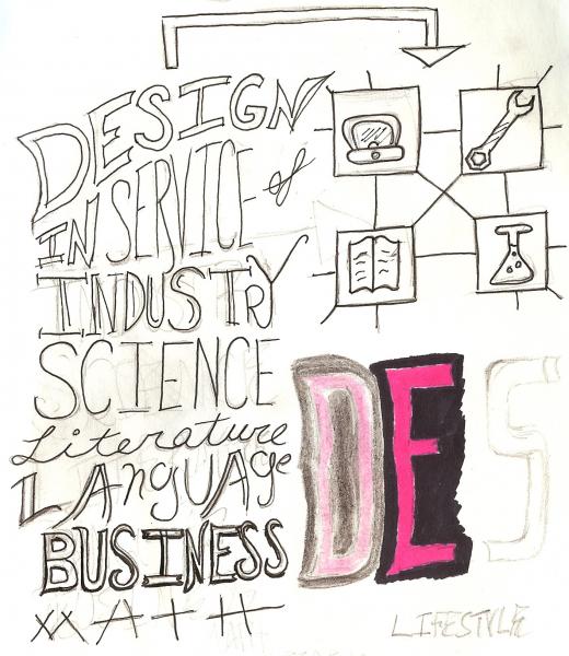
I had forgotten that graphic design’s origins lie in service of other industries. That in order to be a good designer, I had to have a holistic view of history, culture, and society. I had to be willing and able to research and understand virtually any field, and create visual solutions in service of their purposes and messages.
This was something I understood once, back in college. The reason I found taking cultural, historic, and scientific courses so important. I don’t remember when or how I forgot it. Perhaps being immediately removed from an academic environment and thrust into an economy focused on end results pushed these concepts from my brain as a recent graduate desperate to fit in as a successful design professional.
So I had to start thinking; what did I really care about? What kind of messages did I want to design for? And how could I get more excited about projects that would normally not interest me? How could I get across that I was capable of that to viewers of my site and personal brand?
I’ve always had a soft spot for the weird, quirky visual styles presented in Nintendo games, which have the self-described goal of “making people smileâ€, and I wanted to create memorable experiences in that vein. I also could always self-describe as a bit of a science geek; the search for the Higgs Boson, space exploration, evolution, global warming and finding alternative energy sources, and so forth were topics that not only caught my attention, but that I considered crucial to the future development of humanity. Personal exploration, development, and exercise through outdoor activities, such as hiking and skiing, along with international travel, were things that I loved and thought improved general quality of life as well. I thought that my own personal brand, then, should reflect these interests and promote them, so that, ideally, I could find clients and employers who valued the same styles and topics that I did.
But I couldn’t just be a designer anymore. I had to contribute in bigger ways. I wanted to assist in technological development, continue to promote and advance technologies as solutions to real-world problems. I wanted to help develop web applications, which requires not only the planning and high-level knowledge of general graphic design, but also technical skill and a deep understanding of computer and web systems. I may never be a computer scientist by any means, but I feel that if I can contribute in ways both practical and augmentable, in development and design, I can be in a position that truly feels valuable. Just as design should be in service to a message, my design abilities should be in service to my development skills and values, or those of the company I work for.